Brand kit
The mark
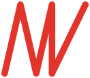
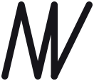
A key's cut, in front of an M and a K sharing one stem. Five strokes, one colour, no second version of it anywhere — the same two paths render the favicon, the nav, the social card and the sticker.
It is drawn by scripts/brand/mark.mjs from five numbers and generated into
every file below by npm run logo. Nobody hand-writes the path data, so the
nav mark and the favicon cannot quietly stop being the same shape.
One colour per context
The mark is never split. All red on the white page, all white on the block — one colour per context, whatever the context is. Every two-tone version was tried and every one of them destroyed the letters instead of decorating them: a red stroke on a red field is an invisible stroke, and the mark is only five strokes to begin with. Lose one and there is nothing left to read.
The block in the second tile is squared off, not torn — these tiles are under the size the rough edge is tuned for, and down here the filter chews the mark instead of the edge. That rule is the next section but one, and this is it being obeyed.
How it is drawn
-
Three teeth
Leaning 13° off vertical — the cut of a key, the part that actually opens something.
-
A true vertical
Dead upright. A capital M closes on a vertical and a capital K stands on one; this is that stroke, drawn once, doing both jobs.
-
The leg
Kicking out at 26° — the K’s leg, at twice the teeth’s angle, so the eye cannot file it as a fourth tooth.
The two angles are different on purpose, and that is the part most likely to get tidied up by someone with good instincts. Matched, the leg is another tooth: the eye reads one long zigzag, stops, and the K disappears. 13 against 26 is what keeps them separate. The stroke weight is not a taste call either — closing the teeth closes the gaps between them, and a heavier stroke fills the counters in until the mark goes solid at favicon size.
The rough edge
The block's edge is torn, not cut — that is the fuzziness of a wish, which is vague until somebody builds it. It is an SVG displacement filter applied to the edge of the shape, not a texture and not an image, so it holds at any size and re-colours with the block. A browser that cannot render filters draws a clean square, which is a perfectly good mark.
It is a display device. The displacement is a fixed amount in the shape's own units, so below roughly 240 px it stops being an edge and starts being damage — the favicon uses a clean one for exactly that reason. If you are placing the block small, square it off.
The wordmark
Mate, the middle word in red, Key — set in Fraunces at 700. The name is a dad joke on mine (Mate Visky) and the red sits on the word that does the joke.
Below about 19 px the wordmark goes all ink, as in the second sample. The red measures 4.41:1 on white, which is fine for display sizes and not fine for small text, so the colour drops out rather than the rule bending. Use the all-ink version for single-colour work too — a stamp, an embroidery file, a one-colour print.
The colour
One hue. #e2342b, and nothing else. Everything not red on this site is a neutral, and that is the whole palette — there is no secondary colour to reach for, on purpose.
The red is a surface colour first: a block, a button, the mark, a heading word. #e2342b is 4.41:1 against white, which clears AA for large text and misses it for body copy, so a second, darker red carries anything at reading size. White on the red is the only text combination allowed on top of it, and only large or bold.
- Red
#e2342bThe one hue. Fills, the mark, display type. 4.41:1 on white — large text and graphics only. - Red, readable
#c9251dThe only red at body size: links, kickers, small bold. 5.58:1 on white. On a dark ground it goes lighter, to #f0524a. - Red, bright
#f0524aHover on something already red. Never text. - White
#ffffffThe page, and the only colour that ever sits on top of the red. - Ink
#16151aEverything you read. 18.16:1 on white. - Mute
#56525cStandfirsts, captions, meta. 7.62:1 on white. - Faint
#8d8891Small uppercase mono labels only, at 11px and up, bold. 3.46:1 — which is why it is never prose.
The dark theme re-measures all of it against a near-black page rather than inverting it — the
readable red gets lighter there, not darker. The live values are in src/styles/global.css, each one carrying the ratio it was measured at, and the design kit renders both themes side by side.
Type
- Fraunces — display. Headings and the wordmark, 700, with 600 italic for a second line. A serif with a bit of wonk in it, because this is one bloke talking and not a product.
- Manrope — body copy, 400 and 700.
- JetBrains Mono — prompts, commands and file paths, and the small uppercase labels.
- All three are self-hosted and subset at build, so the page never calls a font host while someone is reading it.
- Mono is reserved for things that are literally code — plus those short tracked labels, where it is a brand voice rather than a claim. Sentences never go in it: a site written for people who have never opened a terminal should not look like a developer tool.
Icons
56 shapes on a 24×24 grid, 2px stroke, round caps and joins. They
inherit currentColor, so set the colour on the parent. Deliberately not an icon
library — this many icons is not worth a dependency to keep patched and licensed forever.
-
arrow-right -
arrow-left -
arrow-up-right -
chevron-right -
chevron-left -
chevron-down -
chevron-up -
home -
menu -
close -
external-link -
play -
pause -
live -
video -
mic -
calendar -
sparkle -
sparkles -
lamp -
wand -
heart -
star -
terminal -
code -
file -
folder -
folder-tree -
download -
upload -
copy -
save -
trash -
refresh -
settings -
git -
check -
circle-check -
circle-x -
warning -
info -
question -
lock -
unlock -
shield -
undo -
eye -
clock -
search -
book -
tag -
link -
mail -
rss -
sun -
moon
The files
Every one of these is written by npm run logo from the same geometry, in the same
run, so they cannot drift from each other or from what you see above.
-
mwk-mark.svgThe mark in red, for a white or very light ground. -
mwk-mark-white.svgThe mark in white, for the red block or a dark ground. -
mwk-mark-ink.svgOne ink, #16151a — single-colour print, embroidery, a stamp. -
favicon.svgThe red tile with the white mark, and a clean edge — the torn one becomes damage at that size.


Using it
These are free to use when you are talking about or linking to what I make. Give the mark about one mark-width of clear space on every side, and let it sit on white, on the red, or on one flat ink — not on a photo or a busy background.
Please don't stretch it, add shadows or gradients, split it into two colours, re-angle the strokes, rotate it, or recolour it outside the palette above. And please don't use it in a way that suggests I made or endorsed something I didn't.
Need something else — a transparent PNG, a particular size, a version for a dark background? contact@matewishkey.com. Mate Wish Key, Brisbane, Australia.