Design kit
The parts
Everything the site is made of, rendering live. Not a description of the components — the components. If something here looks wrong, it is wrong on the site too.
White dominates
The page is pure white, not cream, and it stays that way. The red is one block on a white page, never a wash over it — the block reads as loud because of how much white is around it, so spending the red twice spends the effect.
Red is the only hue. Everything else is a neutral. If you are reaching for a second colour, the answer is a neutral, a weight, or more white.
Where the red may go
#e2342b measures 4.41:1 on white. That clears AA for large text (3:1) and misses it for body copy (4.5:1) — by a hair, which is the dangerous kind of miss, because it looks fine to whoever picked it. So the red splits into three values that are not interchangeable: a surface colour, a text colour, and a fill for anything that has words on it — because a white label on #e2342b is that same 4.41:1, and a button label is not large text however bold you set it.
Red belongs here
- A fill with nothing written on it — the block, a rule, a bar.
- The mark, at any size, in one colour.
- A display word at 19 px/700 or bigger.
- A glyph set large: /
-
At body size, only as
--red-deep— this link is that colour, and it measures 5.58:1.
And nowhere near here
- Body copy. Paragraphs are
--ink, always. - Captions, meta lines, small print —
--mute. - A 14 px link, a form label, a table header.
-
Under a label — a button, a pill, a badge. That is
--red-field, which is darker for exactly this reason. - Anything on top of a red field except white.
- A second hue, borrowed from anywhere, for any reason.
The previous brand broke its entire light theme by using a surface colour as a text colour — links at 3.59:1, kickers at 2.14:1, quotes at 1.41:1 that nobody could read. That is the failure this split exists to prevent, and it is why every value below is quoted with the ground it was measured against.
Colour
- Red
--red
#e2342blight#e2342bdark 4.41:1 light · 4.23:1 darkThe one hue. A SURFACE and a display colour: the block, the mark, a glyph, a heading word at 19px/700 or bigger. Never a paragraph, never a caption, never a small link — and never a fill with a label on it, because white on it is that same 4.41:1.
- Red, field
--red-field
#c9251dlight#c9251ddark 5.58:1 against the white labelThe fill for a red thing with WORDS on it — the primary button, the live pill, the skip link. One value in both themes, because what it has to clear is the white label sitting on it, not the page underneath. Its hover (--red-field-hover) is the theme-aware half: it darkens on white and lifts on the dark page, so the label never gets harder to read on the way in.
- Red, readable
--red-deep
#c9251dlight#f0524adark 5.58:1 light · 5.34:1 darkThe only red allowed at body size — links, kickers, small bold, inline code. It goes darker on white and lighter on the dark page, because the ground moved.
- Red, bright
--red-bright
#f0524alight#f8776fdark 3.49:1 lightHover on something that is already a red fill. Never text.
- On red
--on-red
#fffffflight#ffffffdark 4.41:1 on --red · 5.58:1 on --red-fieldWhite, and only white, on a red field. On --red that is 4.41:1, which buys a GRAPHIC (the mark on the block) and large display type — not a label. Anything with words in it sits on --red-field instead.
- Paper
--paper
#fffffflight#131217dark the groundThe page. Pure white, not cream — white is the dominant colour of this brand and the red only reads as loud because of how much of it there is.
- Surface
--surface
#f7f6f5light#1b1a21dark the groundA panel lifted off the page.
- Surface 2
--surface-2
#efedealight#232128dark the groundA panel on a panel; the code-block ground. The harder background to pass contrast against, which is why every ratio above is quoted against it too.
- Line
--line
#e9e6e2light#2c2a33dark decorativeHairlines and dividers. Decorative only — it is not required to pass anything, and nothing you need to see is drawn in it.
- Edge
--edge
#8a848elight#7a7482dark 3.64:1 light · 4.13:1 darkThe border of something you can click or type in. Non-text contrast needs 3:1, which is a different bar from text and this clears it.
- Ink
--ink
#16151alight#f4f2f6dark 18.16:1 light · 16.76:1 darkBody copy and headings. Nearly everything you read on this site is this colour.
- Mute
--mute
#56525clight#a8a2b0dark 7.62:1 light · 7.51:1 darkThe standfirst, meta lines, captions. Still AAA — quiet is not the same as low contrast.
- Faint
--faint
#6c6771light#8e8896dark 5.50:1 light · 5.43:1 darkLabels — kickers, eyebrows, breadcrumbs, captions — BOLD UPPERCASE MONO, and nothing else. It used to be two steps lighter on the theory that the treatment let it hold at 3.46:1; there is no such exemption, and it was the kicker on every page. Never prose, never a sentence, never a link.
The mark
Five strokes: three teeth leaning 13° off vertical, a true vertical, and a leg kicking out at 26°. It is the cut of a key in front of an M and a K sharing one stem. The two angles are different on purpose — matched, the leg becomes a fourth tooth and the whole thing reads as one long zigzag. How it is built and how to use it: the brand kit.
One colour per context, and the mark is never split. All red on the white page, all white on the red block. Two-tone was tried in every combination and it destroys the letters rather than decorating them: a red stroke on a red field is an invisible stroke, and once one of the five is gone there is no mark left to read.
The block in the middle is squared off, not torn. These tiles are well under the size the rough edge is tuned for, and at this scale the filter chews the mark rather than the edge — which is the rule below, demonstrated by obeying it.
The wordmark
Mate, the middle word in red, Key. The name is a dad joke on mine and it is meant to land as one — the red is on the word that does the joke, not scattered across all three.
Below about 19 px it drops to all ink — the second sample above, which is the
component's ink variant. Same 4.41:1 rule as everywhere else: under display size
the red word stops being a display word and starts being body text. The footer wordmark, at
14 px, is the one you will see this on.
Three strokes, no numbers
There are no numbers anywhere on this site. Not on the beats below, not on a list of steps, not on a set of features. A number would be arbitrary — three because three fits the grid. These three are the logo taken apart, so the marker means something.
-
One wish
a tooth of the key — the thing you wish your computer did
-
a few key strokes
the counter-tooth — the words that turn it into a thing
-
your mates deliver
the stem — the vertical the M closes on and the K stands on
The rough edge
The block's edge is torn, not cut. That is the fuzziness of a wish: it is vague until somebody builds it, and the edge says so before a word of copy does.
It is an SVG displacement filter on the edge — feTurbulence feeding feDisplacementMap — not a texture fill and not an image. So it holds at any
size, it costs one inline <svg> for the whole document, it re-colours
with the block, and a browser that cannot do filters draws a clean square, which is a
perfectly good mark rather than a broken one.
Defined once, in src/data/brand.ts, rendered once by the layout. Reach
it with class="rough-edge". Two copies of the filter means two ids in one
document and the second one silently loses.
It is a display device. The displacement is a fixed ~11 user units, so on a big block it is a deckle edge and on a 32 px chip it eats a third of the shape. Below roughly 240 px, use a clean edge — which is why the favicon has one.
Type
Fraunces — display, 700
and 600 italic, for the second line
Manrope — body copy, 400 at 16px on 1.6. Plain, open, quiet.
Manrope 400 at 19px in --mute — the standfirst under a heading.
JetBrains Mono — prompts, commands, file paths
LABEL / KICKER — MONO, 700, UPPERCASE, TRACKED
Three faces, self-hosted and subset at build, so the page never calls a font host at runtime. A display serif with a bit of wonk in it, because this is one bloke talking rather than a product; a plain sans under it; one mono doing two jobs.
Those two mono jobs are worth naming. In a code block it means this is literally code — something you paste into a terminal. In a small uppercase label it is a brand voice, not a claim that the label is code. That is the only place the face is allowed to be decorative, and it holds because the label is short, bold and tracked. Setting sentences in it would make a site written for people who have never opened a terminal look like a developer tool.
The icon library
56 shapes, hand-drawn on a 24×24 grid for a 2px stroke, round
caps and joins, all on the same optical weight — so any two sit together without one looking
bolder. They inherit currentColor, which is what lets the same icon be ink in a
paragraph and white on the block.
Navigation
Getting around. Arrows point where you go, chevrons point at what expands.
-
arrow-right -
arrow-left -
arrow-up-right -
chevron-right -
chevron-left -
chevron-down -
chevron-up -
home -
menu -
close -
external-link
Video and sessions
Recording, playing, scheduling. `live` is the only one that ever gets the red, and only while a session is actually on.
-
play -
pause -
live -
video -
mic -
calendar
Wishes
The brand vocabulary — wishing, granting, favourites.
-
sparkle -
sparkles -
lamp -
wand -
heart -
star
Machine
Terminals, files, repos — the things a prompt actually touches.
-
terminal -
code -
file -
folder -
folder-tree -
download -
upload -
copy -
save -
trash -
refresh -
settings -
git
State & safety
Outcomes and warnings. `undo` earns its place: it is the question to ask before you run anything.
-
check -
circle-check -
circle-x -
warning -
info -
question -
lock -
unlock -
shield -
undo -
eye -
clock
Reading & finding
Search, glossary, tags, feeds.
-
search -
book -
tag -
link -
mail -
rss
Theme
The dark/light toggle, and nothing else.
-
sun -
moon
Components
Buttons
One filled and one outlined, and that is the whole set. A third variant would need a second colour to be a variant of anything.
Tags
Card
Code block, with its copy button
Every code block in rendered content gets one. The prompt is the single thing a visitor has to get out of a project page intact, and selecting thirty lines in a scrolling box on a phone is genuinely awful.
The button is labelled Copy and keeps saying Copy — only the glyph swaps on success, so
the box never resizes under the reader's eye. And nothing but the prompt ever goes inside the <pre>: the button serialises the block's text, so a line-number gutter or a
language badge in there gets copied into the prompt and corrupts it silently.
echo "the copy button is added at runtime, to every block"Artwork
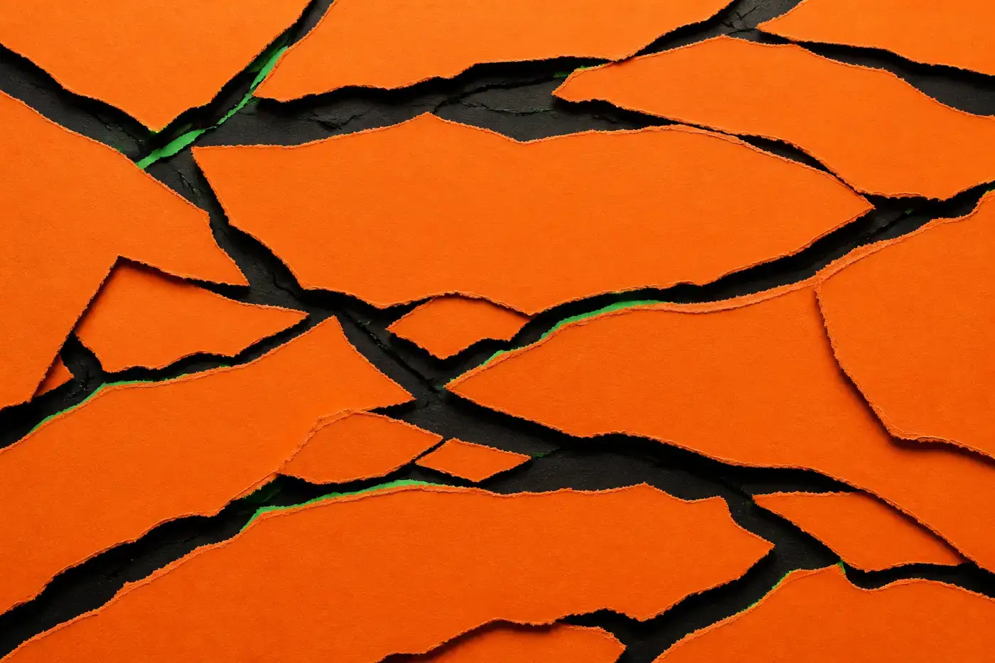
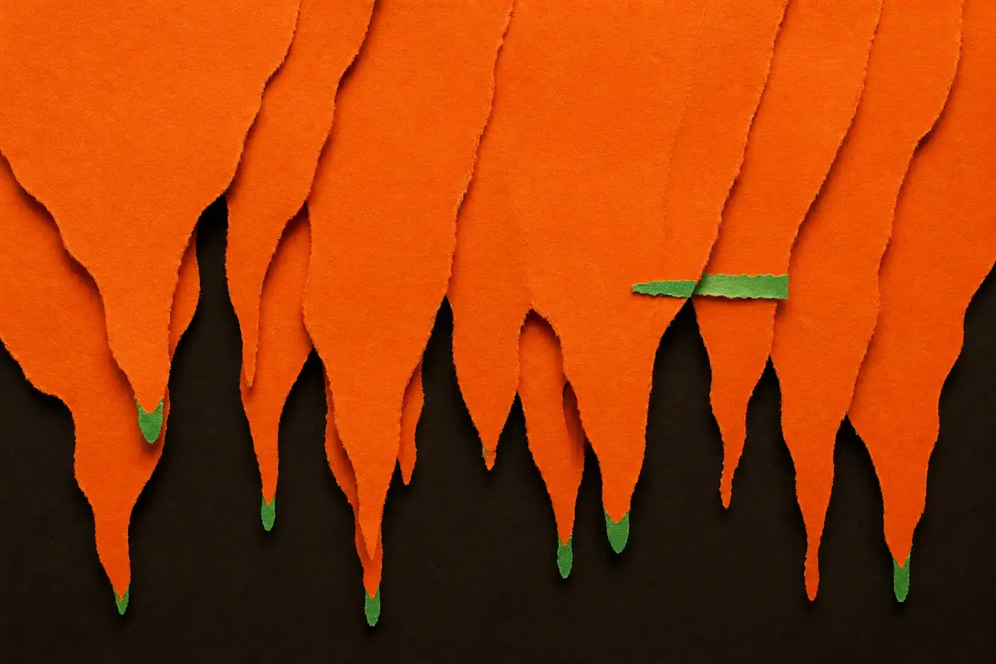
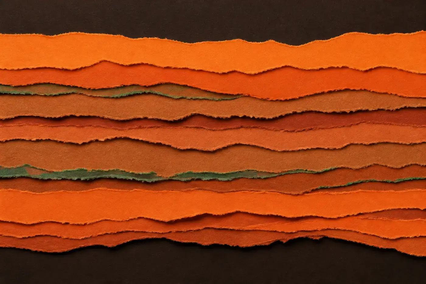
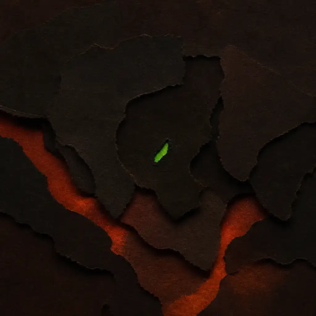
Abstract cut-paper collage, used as the banner on the listing pages. It is generated: node scripts/art/generate.mjs, with the concepts in scripts/art/concepts.json and the medium in a single constant, so the whole set
can be restyled in one edit. Alt text is written by the same script into src/assets/art/alt.json and read from there — a description kept anywhere else
drifts from its picture, and it drifts for exactly the readers who cannot check.
This set was made for the previous identity and still carries its two colours. Four of
the thirteen are below; the rest are in src/assets/art. It is the one part of the
site that has not been redrawn against the one red — read it as a placeholder, not as a licence
to bring a second hue back.
Every page
All 14 of them, live. These are iframes of the real pages, not screenshots — a screenshot is a picture of the site as it was the day someone last remembered to retake it. Click any one to open it properly.
/ The pitch, what is on, the mark, the latest wishes. /projects One project = one wish, led by the wish in the asker’s own words. /projects/put-the-genie-in-the-box The prompt with its copy button, what you need first, and the honest bits. /updates Dated notes, in the same feed as the projects. /updates/the-site-is-up One dated note. Same prose and code styling as a project. /glossary Every word, one line each. /glossary/agent What it is, why it matters, an analogy that holds up. /now What I am doing at the moment. One hand-edited file. /about What this is, what it is not, the name, the as-is note. /media The mark, the files, the colour, the type, how to use it. /design This page. /privacy What the site collects, which is close to nothing. /search Orama, entirely in the browser. Ctrl-K anywhere. /404 The wish that did not come true.